Insert Cbox code here
Bituwin -
template
Dementee -
image
Words from Before It's Too Late by Goo Goo Dolls.
Hit counter code here
Saturday, September 6, 2008
Post 5:


This work was done in Bocchignano, Italy, a village close to Rome, as part of the group project "20 Eventi". The group of artists developed projects for 4 villages of the Sabina region and decided to create a compilation of drawings, for collectors to purchase, and to support this project.
See more of Jan Vormann's Dispatchwork here.
The artists filled the gap between the dull and earthy bricked and rocks with colourful Lego bricks. Besides the contrast of colours, there are also contrasts of natural material and plastic, regular and irregular shapes, modern and old objects.
Post 4
Is architecture art?
I always think that architectures are like giant sculptures that we can walk in and out, and architects are space crafters who create architecture which materializes in expressive forms ,that respond to human necessities ,which we call functions .the functions are never just utilitarian , they always have purposes too : symbolic ,cultural ,artistic .these expressive forms have meanings to humans , they do have a symbolic and aesthetic finality , they provoke a certain impression to humans and are conceived in such a way .
Some sculptural works by Rachel Whiteread and Anish Kapoor do overlap with architecture in the way that they relate to people through a space, especially those works displayed in the Turbine Hall in Tate Modern, London.
Gaudi is a prime example of architecture as art, where his forms are so organic they are more artistic fantasy than architecture. Gaudí, throughout his life, studied nature's angles and curves and incorporated them into his designs. Instead of relying on geometric shapes, he mimicked the way men stand upright. The hyperboloids and paraboloids he borrowed from nature were easily reinforced by steel rods and allowed his designs to resemble elements from the environment.Having said that, the Sagrada Familia church constucted by Gaudi is also an awesome piece of structural engineering, proving that architecture can fulfil the criteria of both an art and a science.
Many great architects were also artists, Le Corbusier being a strong example. Le Corbusier's post-war buildings rejected his earlier industrial forms and utilized vernacular materials, brute concrete and articulated structure. Near the end of his career he worked on several projects in India, which utilized brutal materials and sculptural forms. In these buildings he readopted the recessed structural column, the expressive staircase, and the flat undecorated plane of his celebrated five points of architecture.
However, utilitarian architecture - where it is simply built for the purpose its required for there has been no emotion put into this just so long as the building regs are checked, the planning permission is granted and the costs stack up. I still think this is not art to me .
Post 3:


I picked up a copy of Style: magazine from my roomate's table and read it yesterday. It was another ordinary fashion magazine but what surprised me is the photoshots in the magazine! The theme is Cubism, and everything is about geometry and clean lines.
Everything that are worn on the models is exaggerated, for example, their sholders are broadened, hips are sculpted and shoes are elaborate. The clothings look stiff, as if they are sculptures worn on women. The sharp angles and geometry shapes are the most significant features for Cubism, and besides that, the features also bring in a sense of Futurism to the overall look. The design is minimal and emphasises on the overall shape and the texture of the textiles.The heavy and volumized upper parts are always balanced with a tight bottom, or vice versa to avoid overloaded visualization. The colour used are mainly cold colours, such as black, white, silver, blue and violet. The models are either emotionless or looking away. This enables them to make us feel as if they are robot like or inhuman, or someone who travelled time and come form the future. Or perhaps, the artist want to tell the audience that women now are strong, powerful and sophiscated and are moving in with time to advance their influence in the society. And also that, women can be womanly, and yet do not exploit their feminity by baring her skin and be seen purely as a beauty object by men in the patriarchal society, like they did in the past.
Post 2


“Everyone has a sweater or a scarf knit by a grandmother or an aunt,” says Magda Sayeg. “There’s something about the amount of work that goes into a piece that shows care. Knitting is an act of love.”
She has a group of ten knitters, kniting to sweaters—not for people but for things you found on the streets like stop signs,expired parking meters, bicycle racks and telephone poles. This action is started in October 2005 with a very localized act and has exploded into an international guerilla public-art campaign.
I think this art campaign is cute and a great idea to publicize the idea of showing care and love, not only to the people you know, but to the things around you (which you might probably neglect) as well. When the artist is asked for the reason to start kniting for objects, “Houston (the place where she lives) is a lot of steel and cement—not so pretty,” Sayeg explains. Now, not only Houston, even a stone at the Great Wall of China is found wearing a knitted jacket.
Not only this is a creative way to publize "Love", it also consists of public involvement in this art campaign.
You can now start picking up a pair of needles and a ball of wool, and start knitting for the metal pole in the mrt train to be part of this public art campaign! (Dont blame me if you got caught or something, i am not too sure if this is illegal though.)
Friday, August 29, 2008
Post 1: Cy Twonbly


Cy Twombly (born April 25, 1928) is an American artist well known for his large scale, freely-scribbled, calligraphic style graffiti paintings; on solid fields of mostly grey, tan or off-white colors. Twombly is best known for blurring the line between drawing and painting. Many of his best-known paintings of the late 1960s are reminiscent of a school blackboard someone has practiced cursive handwriting of letter "e" and "'s" on, or hundreds of years of bathroom graffiti on a wall in his paintings of the late 1950s and early 1960s).
Borrowing from the idea from surrealism, he experimented with sketching in the dark. For a time, he also forced himself to draw with his left hand.Twombly had at this point done away with painting a representational subject matter, citing the line or smudge, each mark with its own history, as its own subject. Later, many of his paintings and works on paper move into "romantic symbolism", as titles can be visually interpreted through shapes and forms and words. Twombly often quoted the poet Stephane Mallarme, as well as countless myths and allegories in his works. Examples of this are his famous work Apollo And The Artist, or a series of eight drawings consisting solely of the word "VIRGIL".
"Oh my, you call that art?!" i think i can already imagine how most people would respond when i show them the painting of Cy Twonbly. They looks like scribbles of children under a magnifying glass. His works are similar to those produced from pop artist like Jackson Pollocks because works from them have no definate form or subject matter. They are messy, calligraphic scribbles, have no central focus, no concentration of effect to draw attention to.They are created with the intention to bring out the most true and basic idea of the artist which is yet to be contructed into a complete picture.They just have to pick out the paint brush (or a bottle of paint in the case of Pollocks) and move according the motion where their instincts tell them to directly without too much consideration.The instantanous emotions is hence best brought up through this kind of action painting. The dripping and flowing of paint is spontaneous and unrepeatable, so it will the the one and only piece in the world as it can never be cloned.
As you look closer to it, you will find that through the fegmented lines and patches of colours, you will feel a strong emotion coming within you, wheter it's fear, disturbed or peace. Everyone responds differently towards an artwork, and i think that is meaningful as there is interaction between the art and its audience, and it make the painting something we experience as much as we see.
Sunday, May 18, 2008
just someting i found really cute to share with you guys:
done by
SamuelFrancois
maybe we shall find some trees and cover up their barks up in cute patterned clothes like this in school :D
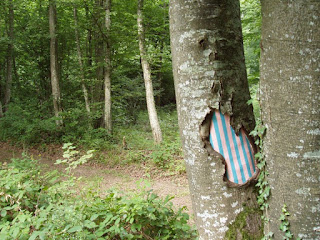


done by
SamuelFrancois
maybe we shall find some trees and cover up their barks up in cute patterned clothes like this in school :D


Jeff Koons
Jeff Koons made a series of painting themed "Celebration" using oil on canvas. He uses reflective plastic paper as the background and has subject matters like balloons, cakes, party hats, play dohs, bows, cracked eggs, party ornaments etc in this series of painting. The paintings look so real that i almost mistaken them as photos.


He also makes gigantic stainless steel sculptures of balloons and ornaments that he had drawn in his paintings and exhibited them in public places like malls, parks and gardens.


Things appear in parties like balloons remind us of the happiness and good memories with our friends and family. However stuffs like balloons are momentary and never stay long. We usually forget about the parties and whatever celebrations we had after just a few days. By making a stainless steel sculpture which would stay permanently in one place, the artist is able to bring happiness to everyone who passes by it. Maybe the secret of joyfulness in a party is hidden in all these little balloons which usually burst and forgotten after the day. Hopefully the gigantic and permanent balloons made by Jeff Koons can bring out joy for whoever sees it or walking pass it.
Jeff Koons made a series of painting themed "Celebration" using oil on canvas. He uses reflective plastic paper as the background and has subject matters like balloons, cakes, party hats, play dohs, bows, cracked eggs, party ornaments etc in this series of painting. The paintings look so real that i almost mistaken them as photos.


He also makes gigantic stainless steel sculptures of balloons and ornaments that he had drawn in his paintings and exhibited them in public places like malls, parks and gardens.


Things appear in parties like balloons remind us of the happiness and good memories with our friends and family. However stuffs like balloons are momentary and never stay long. We usually forget about the parties and whatever celebrations we had after just a few days. By making a stainless steel sculpture which would stay permanently in one place, the artist is able to bring happiness to everyone who passes by it. Maybe the secret of joyfulness in a party is hidden in all these little balloons which usually burst and forgotten after the day. Hopefully the gigantic and permanent balloons made by Jeff Koons can bring out joy for whoever sees it or walking pass it.
Saturday, May 17, 2008
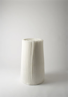
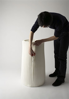
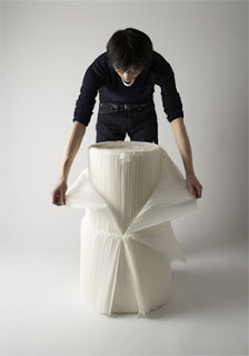


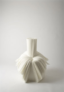
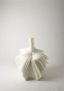
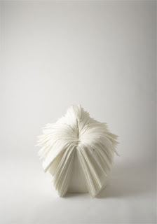
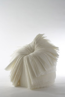
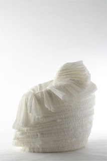
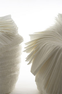
cabbage chair
Tokyo
21_21 DESIGN SIGHT
2008.03
Nendo company designed the cabbage chair for XXIst Century Man exhibition curated by Issey Miyake to commemorate the first anniversary of 21_21 Design Sight in Roppongi, Tokyo.The chair is made out of the pleated paper that is produced in mass amounts during the process of making pleated fabric, and usually abandoned as an unwanted by-product.The creator transformed a roll of pleated paper into a small chair that appears naturally as you peel away its outside layers, one layer at a time. Resins are added during the original paper production process so as to add strength and the ability to remember forms. The pleats themselves give the chair elasticity and a springy resilience, for an overall effect that looks almost rough, but gives the user a soft, comfortable seating experience.
i like how this chair is cleverly made by using unwanted by-product. It is not only environmentally friendly, but also functional and most importantly, looks totally cool. The cabbage chair goes minimalist from it's material, it's making process, the colour, the texture to it's form before and after it is "peeled". The chair has no internal structure. It is not finished, and it is assembled without nails or screws. Like a cabbage, the chair has a core where the side of which is being peeled off bit by bit until it forms the shape of a chair.
Sunday, March 16, 2008
Models: Lily Donaldson, Kinga Rajzak, & Guinevere Van Seenus
Vogue Paris October 2007
Photography by Steven Klein
I like this series of photoshots from Vogue Magazine. Unlike any other magazine photoshots, these photos do not depict how wonderful or goegeous those models are, but instead, they show us the twisted, decadent lives of the models behind the runway. Ironically, the models who are posing for these photos are also well known and skinny, like Lily Donaldson, and are most likely to fit into this stereotype.
The first photo shows a model entering the supermarket on the wheelchair. This is trying to suggest that their legs are so presious that they should be used only when are are paid for, like catwalks on the runway. Walking is too much exercise and energy wasting for them, since they do not really eat, as suggested by the 2nd and 3rd pictures. They last picture shows that the models are giving unfriendly glare to the camera, which interprets:
"Skinny goddesses who look better than you any day, that's us."
The colours used are very cold, mostly blue and green. This is trying to depict how un-humanly they from our point of view are; and how they are different from people like us from theirs. The pale and overly painted faces also suggest that everything negative of theirs is hidden under the glamorous masks which every girls wanted so much.
The clothes that the models are wearing are very silimar to the background in terms of colours and tones. This may suggest that the models are just like the grocery products at the supermarket. They, (both the products and models) are packaged nicely on the outside to grab attentions from the people so that they would buy them (the grocery, designer products).
The subject matters may be exaggerated, but i think this is done to stand out the theme of the photoshots. The ironicalness, using models to critise models, is interesting and attention grabbing. It makes people who read Vogue magazine (who are fashion concious) to double think if they are one of the fashion victims who worships the glorified models.
The East Coast Vendor by Georgette Chen
In the foreground, the subject matter portrays the happy locals living along the coastline. The mother and her two daughters are wearing traditional attires, the baju kurung. The background consists of the beach, the sea and few fishing boats. The orangy sky and the direction of the boat, sailing towards the shore, tell us that it is in the evening where the sun sets.
The colours used are warm and bright, mainly red and orange. The colours are flat. Outlines are thick, obvious and drawn with earth tone colours like brown and red. The texture is a little bit like impressionist, the effect created is like ripples on the canvas. It makes the painting look like water colored. The brushstrokes are clear with depth of colours.
The painting tells us the relationship between the natives' lives and the sea. The sea is the place providing them with resources like food and incomes, thus their lives are very much dependent to the sea. The relationship between the mother and her daughters are close. The basket supported on the mother's head symbolizes that their lives are supported by their hard work and the smile on their faces tell us that they are contented with their simple life.
The painting is not effective in portraying the life in Southeast Asia because it does not show all the aspect of their life. And also, the picture portrays only females. However, on the other hand the painting is able to portray clearly how the people dress, where they live and what they live off. Hence, the effectiveness of this work in portraying life in Southeast Asia to a certain extent only.
Feng Zhengjie Primary Colours exhibition
Feng Zhengjie is most well known with his huge portraits of people. The people he drawn includes his parents, himself, Chinese celebrities like sammy zheng xiu wen, and etc.The people in the portraits are painted only with 3 colours, like turquoise, maroon and white. The brush stokes are well defined, you could not even see any clear brushstrokes from far, so it makes it look like printed on giant poster instead of a painting. The artists explained the application of brushstroke as to hide the ugliness within the inner person and to create the artificial perfections, which people normally would like to see, as an contrast. The eyes of the subject matters are looking at different directions, and this is explained as dong zhang xi wang in Chinese. The background of the paintings is always contrasting with the foreground, and the outlines of the people in the portraits are always blended with white into the background.
Another collection of Feng Zhengjie's painting is about the traditional chinese wedding ceremony. The paintings gave me a creepy feeling. The colours used are dark red, yellow and green. The facial expression, smiling, of the couple in the painting looks very unnatural, as if they are forced to do so.
Feng Zhengjie is described as the chinese Andy Warhol but i think his style is not really pop art. I personally do not like his style because it makes me feel uncomfortable looking at them, maybe this is what the artist wanted to achieve?
Friday, February 22, 2008
The Artist's Shit, Breath & Blood.
Piero Manzoni


Merda d'artisa
The ninety cans of "Merda d'artisa" ("Artist's Shit, content 30 gr., freshly preserved, produced and tinned in May 1961"), were first exhibited in the Galleria Pescetto (Albisola Marina) on 12 August 1961.
Manzoni calculated the value of the ninety cans - all numbered, each with a net weight of thirty grams - in accordance with the daily exchange rates for gold.
Manzoni calculated the value of the ninety cans - all numbered, each with a net weight of thirty grams - in accordance with the daily exchange rates for gold.
The series of Artist's Shit (sold at the then-current price of gold), the Artist's Breath ("Fiato d'artista", balloons filled with Manzoni's breath) and the only planned containers of Artist's Blood ("Sangue d'artista") are the results of a process of expropriation and regeneration of the artist's corporeality.
Manzoni's main innovation to this topic is a reflection on the role of the artist's body in contemporary art. The artist find a place of discharge for the projection of his person, replacing, with his own body, the painting and the sculpture. Manzoni offers his own body as an artwork, and the vestiges of the transfigured body become precious relics.
